There’s a large variety of calligraphy nibs available out there and they all have a variety of uses and positives and minuses. I have tried a handful of nibs over the past few years. I do have a few favorites that I keep going back to and using for all of my own calligraphy. Even though I stick to my favorites I have cataloged my thoughts on the ones I have tried so far. If you haven’t found your favorite nib yet don’t worry, just keep trying new ones! Especially since they aren’t that expensive to test. This list is small compared to the nibs available and are my own opinions, which I’m sure others might feel differently. It’s all trial and error and really comes down to personal preference.
A Quick Anatomy of Calligraphy Nibs
Before I get into the calligraphy nibs that I have tried I will break down the parts of a nib. While they are small, they do have quite a few parts to them.
- Tines: This is the two sides of the end of the nib and depending on the flexibility of the nib these tines split apart to create different strokes
- Split: The split is the space between the tines that split apart when pressure is applied to the nib
- Vent: The vent is the hole in the nib that helps the ink flow while you are writing
- Shank: This is the part of the nib that is inserted into your calligraphy pen holder
- Base: The end of the nib (opposite of the tines)
- Text: All nibs should have some sort of identification with the nib maker and the model number
Modern Calligraphy
Favorite Nibs
Check out these nibs and start practicing modern calligraphyCalligraphy Nibs Review
I tried to be objective as possible in my reviews of these nibs, however the right nib is really a personal decision. Here was the process I used to review the nibs:
- Prepped each nib before using it by dipping it in the ink and wiping it off before re-dipping and starting to use it. (You need to prep your nib before using it since they are usually coated with a protectant that hinders ink flow)
- Used the same ink black ink from LHCalligraphy for testing
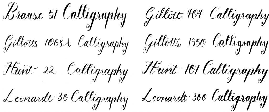
- Inked the nib name and the word Calligraphy with each nib
- Took notes on each nib based on flexibility, ink flow, stroke contrast, smoothness, heavy or soft touch
- Ranked overall how I like it from 1-5 stars
- For fairness I have only included my 3 stars & up on the list
5 Star Calligraphy Nibs
My Favorite: Brause Steno 361 aka “The Blue Pumpkin”
This is my number 1 of all the calligraphy nibs that I have tried. Besides the fact that it is a beautiful nib, it also functions really good for me. It’s a larger nib so it holds quite a bit of ink which means I have to re dip less. It also has a rounder tip which helps it glide over the paper. I am also able to achieve pretty good contrast with my strokes.
Runner Up: Nikko G
This was my first love before I found the blue pumpkin and I even used this one for the calligraphy on my own wedding envelopes. The Nikko G is all around a great nib and is touted as one of the best for beginners, which is probably why I started with it. It flows well, is smooth, and creates high contrast strokes.
Runner Up: Brause 66EF
This Brause nib is pretty great too and I always seem to forget about it! It’s a smaller nib but still holds quite a bit of ink. Also, it’s very smooth and is good at achieving high contrast with strokes.
4 Star Calligraphy Nib
Leonardt 40
This nib looks very similar to the blue pumpkin and is sometimes referred to as a lower cost version of the Brause Steno. Overall it’s a very good nib, but I don’t feel like it’s quite as smooth when I use it vs. the Brause Steno which is why it’s ranked slightly lower for me. I am able to achieve contrast but not as consistently.
3 Star Calligraphy Nibs
The next set of nibs might not have made it to the top of my list but they all had some good qualities. And I’m sure with practice or with the right project they could be the perfect nib!
- Brause 51: Good contrast, a little rough on paper
- Gillott 404: Flexible tines with easy thick strokes but harder to get a consistent thin upstroke
- Gillott 1068A: Pretty good contrast, takes time and practice to go from thin to thick strokes consistently, a little scratchy
- Gillott 1950: Somewhat hard to use, pretty scratchy on paper but doesn’t catch too much, very flexible tines which gets very thick strokes and thins ones with a light touch
- Hunt 22: A little rough, hit or miss on a good flow, high contrast
- Hunt 101: Very flexible and easy to get thick lines
- Leonardt 30: Nice contrast of strokes, but hard to get a consistently thick downstroke
- Leonardt 300: Extremely flexible and smooth, high contrast but easy to end up with too thick of strokes
I hope the review of nibs can help you find one that is right for you. Here is a really fun sampler set if you want to do some of your own testing too. Or if you’re looking for everything you need to start modern calligraphy check out my post here.


Leave a Reply