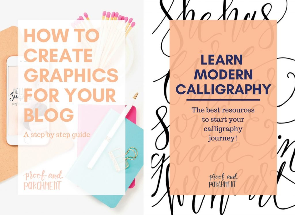
How to Create Blog Graphics That are Eye Catching
Have you ever wondered how to create blog graphics? Well I use InDesign to create all of my graphics and wanted to give you a little more insight into how I create them. All of these tips and steps to create your own blog graphics can be applied to your own graphics no matter what software or program you use to create blog graphics. Plus I’m sharing a few layouts in Canva at the end of the post which you can check out and use for your own blog.
I have shared other elements to blogging like how to stay organized and my own blogging process, but now I’m going into more details on the specific steps, so I hope you learn more about the graphics creation this week!

Your Blog Post’s Header Graphic
The header graphic you use for your blog post is like a book cover, it is the first impression you make when someone shows up to your post. So you want to keep your readers engaged so they will stay on your page and read the whole post.
In order to be successful when you create your blog’s header graphic, there are a few elements you must include to create that awesome impression and keep the readers on your page:
- Catchy title
- Bold type
- Awesome image
- Cohesive color palette
Catchy Title
This might not be specifically design related but is probably the most important part of your graphic plus it can really impact the overall design and layout. If your title isn’t short and to the point your viewers might not give your blog post a chance. You also want to make sure it’s something catchy so it’s easy for the reader to become engaged.

Bold Type
If you don’t know where to start with typefaces then look to your branding and logo. If you have a specific typeface that is part of your brand then you should use it to start creating your graphics. However you also want to make sure it is legible and fits the vibe of your post. Also if you want to use more than one typeface then please limit it to TWO options and make sure they complement each other well. If you use more typefaces then it could start to look like a ransom note and will definitely turn people away. There are some pretty good free and paid resources for typefaces available here are just a few I’ve used: Font Squirrel, Free Typography, and Creative Market.

Awesome Image
Using good imagery is very important in how to create blog graphics, and there are a variety of routes you can go with the background imagery. Personally I try to do a little bit more of a lifestyle image that fits the blog topic. However there are times I will do something more hand lettered in the background to create another connection to the blog post. If you don’t want to use imagery at all then you can also use bold colors and patterns to draw attention and create a statement with your graphic. Finding imagery can be hard, but there are so many resources available. One option depending on your blog topic is to shoot your own photography to use. Another option is to use stock photos, which I have to say have greatly improved over the years and there are so many more amazing options available depending on your needs and budget. I will share more details of the resources I’ve used in a future post. But make sure wherever you get your photos from that you follow the license details so you don’t use anything in the wrong way.

Cohesive Color Palette
The final important element of how to create blog graphics is to use colors effectively. Creating a consistent color palette for your brand and using it on your blog is a great way to create overall cohesion. That doesn’t mean you pick four colors and can’t use any additional ones here and there but it does mean that you should have a core color palette to use from and pick complimentary colors when needed. This will help lay a foundation for your brand and create recognition when someone starts seeing your blog graphics over and over. It will also make it easier to create them without having to pull brand new colors for every post.

How to Create Blog Graphics: Put It All Together
So now that you know the elements you just need to put it all together! I know this is easier said than done. For me I have a few layouts set up and I cycle through them depending on the image I’m using each post. It is almost like a pick your adventure each time I create a blog graphic. This gives my blog graphics a collection feel with just enough of a unique touch for every post.
Here’s some examples I put together in Canva that you can go check out and then try creating some of your own using these guidelines!
I hope this will help you with creating your own graphics for your blog, let me know what else you would like to know about graphics or blogging for future posts.


Leave a Reply